Earlier this month, we quietly rolled out a new design for our monthly invoices. It's a breath of fresh air compared to the previous iteration, and we thought it would be interesting to share what goes into a design like this.
At Heroku, billing is complex. Dyno hours are calculated to the second. Add-ons are calculated based on each provider’s pricing plan, which can be monthly or by usage depending on the add-on. There are support expenses, credits, free dyno hours, and packages. This all has to be wrangled into a format that not only makes sense for the back-end systems that run calculations, but also for the human beings that use Heroku and need to understand what they’re paying for.
Our invoices have been falling short of the human-friendly requirement for a while. With the launch of 2X dynos, we realized our invoices needed to be updated to reflect the usage and pricing for multiple dyno sizes, and leapt at the opportunity to improve their overall quality.
Initial Designs
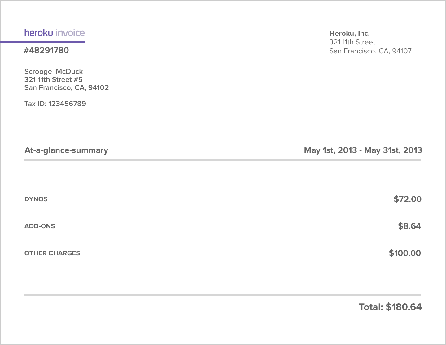
We began with the assumption that the most important thing for users isn’t an app-by-app breakdown of their charges, but instead a more general overview of the resources they’re paying for that can be summarized on a single page. Here’s our first mockup of that concept on an invoice:

After a few iterations, we prototyped a basic version of our summary and new styles, and shared it with our Dashboard Beta users for a first round of feedback.
We gave our testers a URL that rendered their current invoice with the new design, and asked them to fill out a short survey on SurveyMonkey with a handful of open-ended questions.
User Feedback
We received feedback within minutes, and collected our most valuable and actionable data within the first 24 hours of user testing. We learned very quickly our users had a few other important requests:
Less verbose defaults
For users with more than one or two apps, the previous invoice design could make it difficult to find the information you were looking for in a long wall of text.
Improvements to invoice emails
The summary at the start of the invoice was very popular, but many users wanted to see that same information in the email we send at the beginning of the month to let users know that we’re about to bill their account.
The Final Product
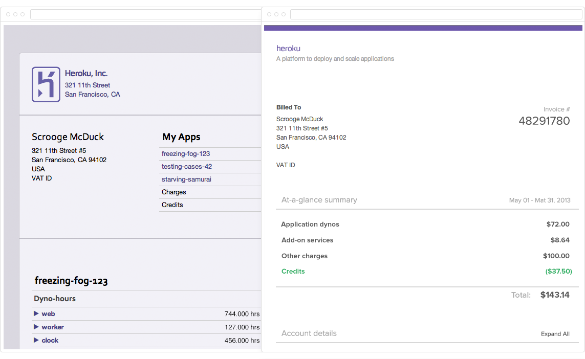
Based on the feedback above and from other testers, we continued to iterate until we were happy with the design. Today, when you view your current usage details from Dashboard, you'll see our new design. Here’s a breakdown of some of the major changes we’ve made:
At-a-glance summary of major information

Every invoice begins with a new section containing line items for your application dynos, add-on services, Heroku credits, one-off charges, and your invoice total.
Improved readability and visuals

The typography and layout of the entire invoice has been redesigned to highlight important information while removing distractions.
Collapsible application details

By default, the details for all apps on your invoice are collapsed into one line item. Expanding an app’s line item will break out your dyno and add-on usage with the same level of detail as the previous invoice design. This way, you can view your invoice with as much or as little detail as you’d like on an app-by-app basis (or click “Expand All” if you really liked viewing the details of all your apps at once).
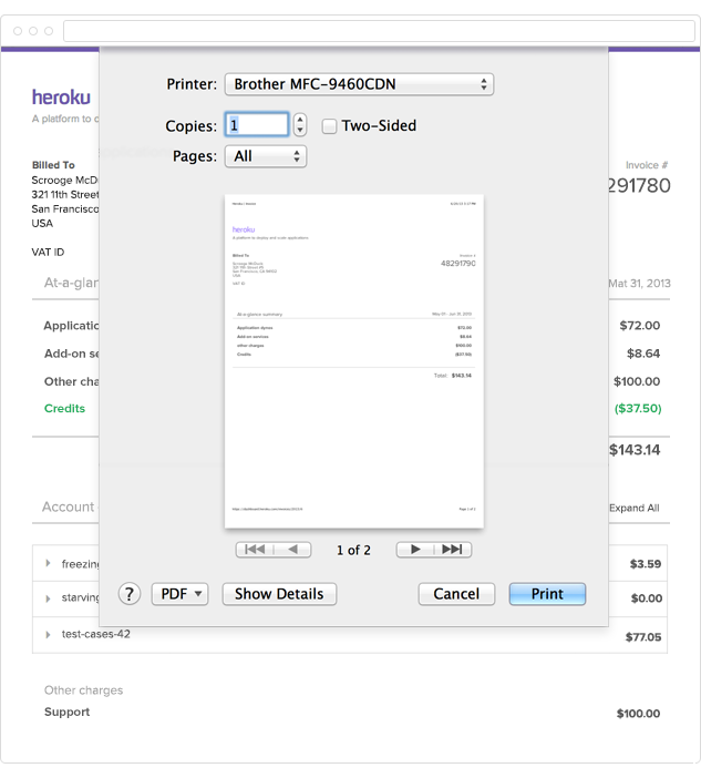
Improved print & print-to-PDF styles

When printing your invoice, we remove unnecessary styles and elements. Your billing information and invoice summary are available by themselves on the first page, and apps are printed in the same expanded or collapsed state as when you were viewing your invoice in the browser.
Summaries in emails

When your next invoice is ready, you’ll receive an HTML and/or plain text email with your billing information and invoice summary embedded in the message body so you can easily forward it to a manager or accountant.
Conclusion
We’re really excited to put the new design in your hands and browsers. We hope that with more readily accessible summaries and less overall clutter, we can remove some common pain points from the billing process. As always, we're constantly iterating on our designs, and we'd love to hear what you think.